From bottles to cans.
BSD crafts a refreshing look for handcrafted kombucha.



PROJECT: BRAND REFRESH
CLIENT: COMKOM
ROLE: CREATIVE DIRECTION + PRODUCTION
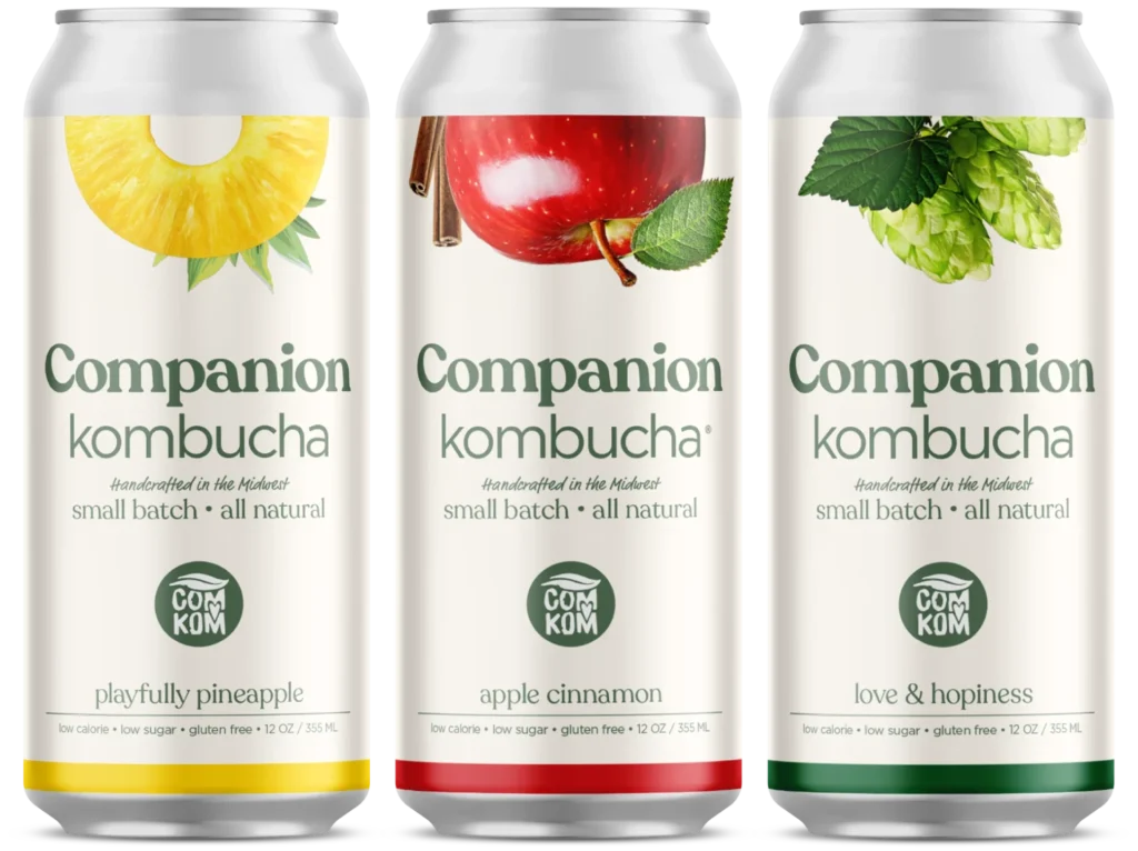
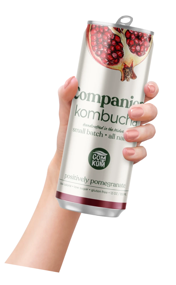
When ComKom decided to move from glass bottles to slim cans, we recommended they use this opportunity for a complete brand refresh. In addition to a developing a look specifically built for cans, we wanted to make the packaging work harder at retail. Our solution features bold fruit imagery at the top of the package that beacons consumers’ attention. The cream-tinted backdrop reinforces the hand-crafted goodness and is complemented with a casual serif type punctuated by the familiar ComKom logo.

